HOW TO EDIT LIKE BRANDON WOELFEL
HOW TO EDIT LIKE BRANDON WOELFEL
There are many editing styles out there, however, one of the most popular artists is Brandon Woelfel. If you don't know him you should definitely go check out his work on instagram. In this mini tutorial we will be using adobe lightroom, however if you watch the video below and check out our youtube channel you can see how his style can be achieved in more detail! Better still, if you want to edit like Brandon Woelfel, but don't have the time to learn, we have compiled an awesome preset pack for you that you can go ahead and purchase from this LINK.
STEP 1 - PHOTO FORMAT AND BASICS
One of the most important things to take into consideration when editing like Brandon Woelfel, is first, you need to take photos like Brandon. This can be challenging but i've compiled a small list that can help, if you take aspects of this list you cant really go to wrong.
- LIGHTING - Make sure your subject is in plenty of light and try and introduce some colour/bokeh in the background
- CAMERA - Camera isn't everything, although it certainly does help. I recommend using a fast lens with an aperture of something like f1.4 to f2.5, this allows for a good depth of field (DOF)
- PHOTO FORMAT - If your camera can take photos in RAW, do it, trust me, it will improve your editing no end. Basically allowing you to 'get more from your image' as there is more data.
- LOCATION - always try and place your subject in a suitable location, eg shop window with reflections, library or a bush. All of these can give great looks.
STEP 2 - THE EDIT
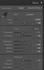
I'm not going to go into too much detail, however, we start by importing our photo into Adobe Lightroom. From here i recommend focusing first on the Basics panel. I have summarised the following steps into a list to make this easier to follow
- WHITE BALANCE - In this particular edit we will focus on making the image more blue and adding some magenta, as this is the effect in many of Brandon Woelfel's images. Drop the temperature slider and increase the tint
- TONE - Next we are going to focus on the exposure, Brandon's images tend to be fairly low in contrast, so drop the contrast slider to around - 50. Next we are going to increase the shadows, and bring back some of the detail. Follow the image below for some guidance
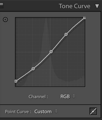
STEP 3 - TONE CURVE
The tone curve is one of the most important tools within Lightroom. Today, we will be using a simple 'S' curve, this will introduce a small amount of contrast back into the image, but at the same time make it pop a bit more. Follow the image below:
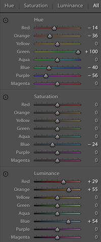
STEP 4 - HUE, SATURATION, LUMINANCE
If your not familiar with these sliders, heres a brief insight. Hue: will allow you to adapt each colour, editing the hues, ie, making greens more brown or reds more orange etc. Saturation: doesn't require much explaining, will change the saturation of each colour. Luminance: this will change the exposure of each colour, making them brighter or darker. For this edit follow these steps:
- RED + ORANGE - lower these sliders, to create a more pink vibe
- GREEN - Increase, by increasing the greens you will reduce the amount of brown in the image, giving it a more 'candy' look
- AQUAS + BLUE - Brandon tends to make slightly more teal edits, in effect making the blues more green and turquoise. To achieve this look we will lower these sliders, but not too much as its very easy to overdo this effect.
- PURPLES + MAGENTAS - Doesn't matter too much, but lower these slightly to make the image more magenta.
As for the saturation and luminance, play with these, but as a basic rule of thumb, desaturate the blues a little, although this is the main colour you don't want it to be overpowering. For luminance, he tends to make the blues brighter in his images.
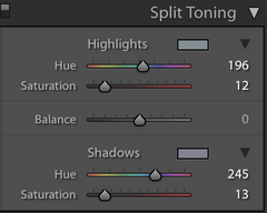
STEP 5 - SPLIT TONING
This is a simple, and usually, minor tweak you can add just to finish off the image. In effect, it will add a colour to your highlights and and a separate one to your shadows, then the saturation is adjusted. For this edit, i tend to go with blues and oranges, adding some blue to the highlights, with saturation from 5-15% and some oranges/purples to the shadows with the same saturation.
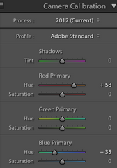
STEP 6 - CAMERA CALIBRATION
This step isn't always necessary, however, when we examine Brandon Woelfels images we can detect a small hint of orange and teal in many of his images. If your new to this O&T is a famous colourgrade used in many feature films and is also a popular choice for many artists. It gives a very realistic effect to an image. To achieve this effect we increase the red hue and decrease the blue hue, very similarly to the HSL sliders, it just gives us some more room to play.
And thats basically it, replicate this for many images and you are done! I will take this time to mention that these presets will only work to their full potential if all the factors in STEP 1 are followed. That being said, you can still tweak them to your desired look.
I hope this mini tutorial was worth it, don't forget to checkout the in depth video, and you can buy the pack HERE.